Torah Tropical, 2024
Designed with David SaraviaArt Direction & Design: David Saravia & Juan Martínez
Motion Design: Juliana Rojas
Photography: Thistopia Films
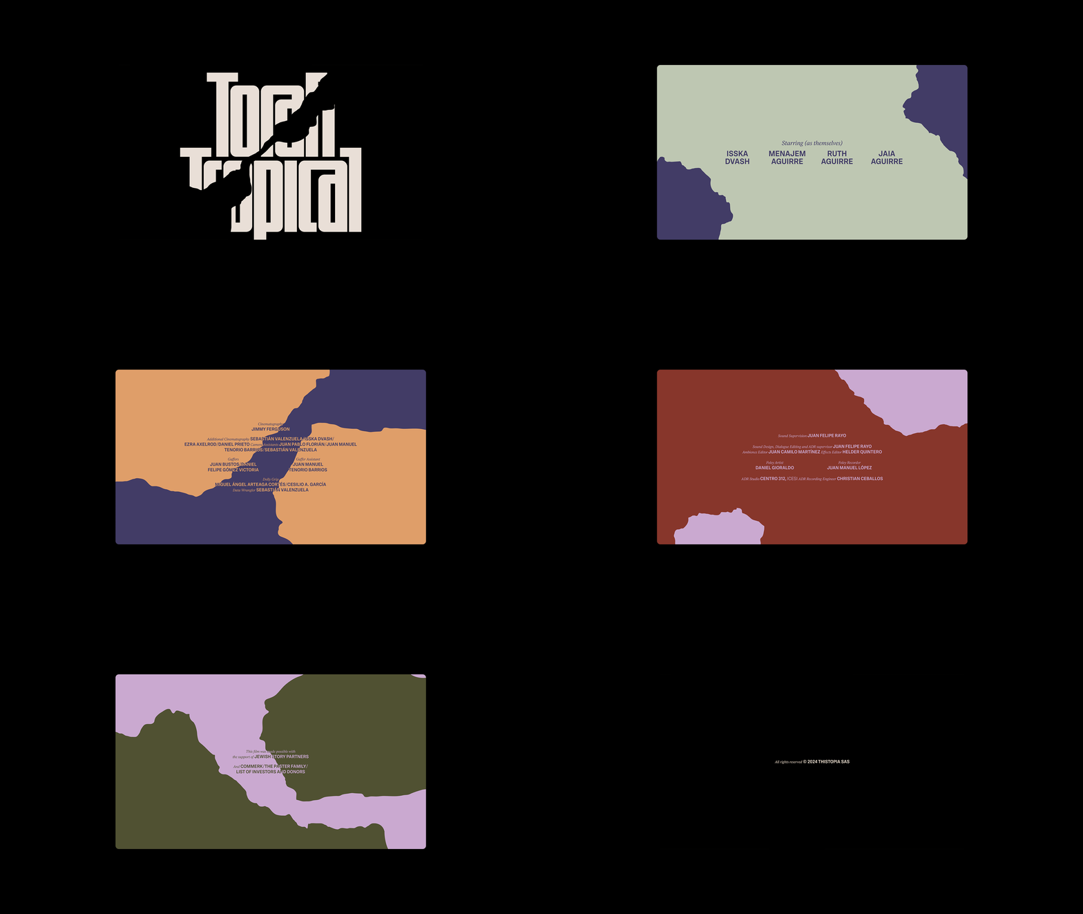
Fonts in use: WT Scrappa by Wise Type, Ivar Text by Letters From Sweden
& Scto Grotesk B by Schick Toikka
Torah Tropical is a documentary film that explores the peculiar phenomenon of Latin American Evangelical Christians converting to Orthodox Judaism and reveals Zionism’s troubling relationship with race and the idea of a Promised Land. It depicts the lengths people will go to in order to improve their lives, find where they belong, and affirm their faith despite struggle and hardship. The production company Thistopia Films tasked us with creating the brand identity, poster design, and title sequence for the film, along with promotional assets for its international festival tour launch and digital presence.
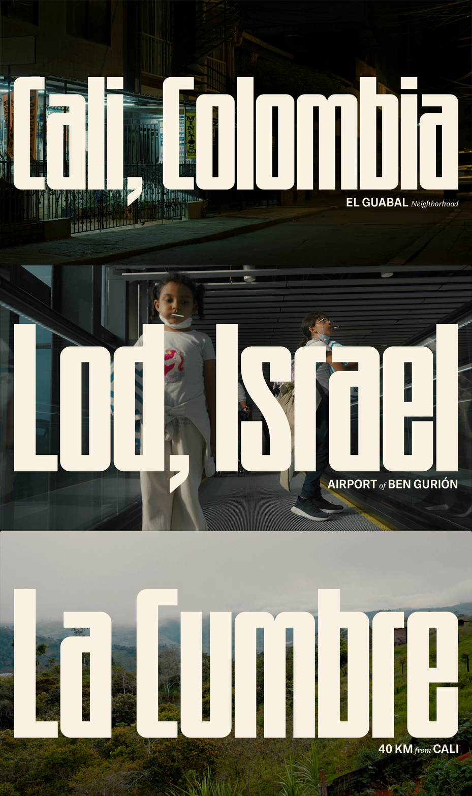
The film follows the journey of a family in Cali, Colombia, who has converted to Orthodox Judaism and longs to escape to Jerusalem, believing the Promised Land is calling them home. The family not only faces migratory and economic barriers but also the invisible walls of religion and culture. The documentary’s identity had to capture the family’s quest for identity and belonging while visually conveying these complex themes in a poetic and clear way.
To represent this conflict, we developed a visual language where rigidity and organicity coexist. We chose a bold, compressed logotype that asserts itself against the tropical landscapes where the documentary takes place. These opposing elements reflect the tension between the strict structure of religion and the fluid, organic nature of the tropics. This contrast extends across the entire identity through the clash of photographs, color palettes, and the juxtaposition of a sans-serif and script typeface, reinforcing the film’s themes throughout the promotional materials and title sequence.


